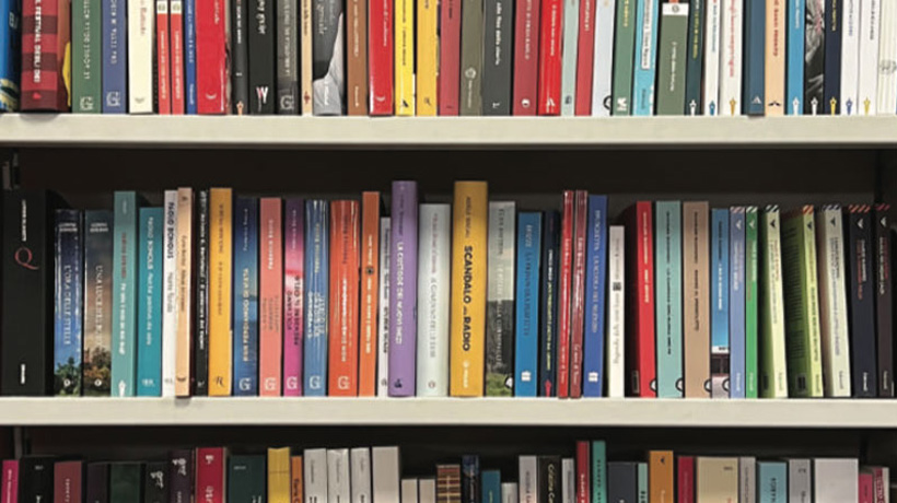
Why is Italian publishing more seemly than publishing in Britain?
Bookshops here are cacophonous: everywhere you turn, covers scream for attention, whether on tabletop displays or on shelves. A thousand typefaces in a thousand sizes argue with each other; cover images all bark noisily for attention. A bookshop may be as quiet as a library, other than the occasional krrr-Ching of the till; visually it’s a mosh pit.
Not in Italy. An Italian bookshop is an oasis of calm, visually and acoustically. Books co-exist. They recognise their mutuality. They even speak the same typographic language: Einaudi’s white covers and minimalist fonts haven’t changed much since the 1940s; Adelphi has 653 books you have to pick up to tell apart.
Across the board there’s a confidence and a discipline. Lettering on an Italian spine is small: rarely even 18pt in size. That means books can’t shout at you from across the store; instead, you go to meet them. You find them both pokerfaced and intimate: Handle them if you wish. But if you don’t wish, va bene!
And in every Italian airport and railway station, there’s a bookshop––or maybe two: a Feltrinelli or Libraccio or Giunti––usually with a huge amount of floor space where they tend to prioritize order and curation over flashy displays. Books may be set out by genre but also by imprint, making it easy for readers to find titles from publishers they trust.
The idea of a book as a quiet thing, designed for contemplation, was shared by us once. In the days when Penguin was a modern miracle, it went without saying that its covers differed only by their wording. The only cover font allowed by Jan Tschichold––a foreigner, admittedly––who standardised Penguin’s entire range between 1947 and 1949, was Gill Sans, in different weights and equalised letter-spacing. It’s his standardised covers that we now look back to as classics-–and buy emblazoned on mugs.
Today, sadly, Penguin is among the worst of fenders. It makes occasional forays into typographic discipline but cynically links this to the nostalgia market.
Why the difference? Culture. Tradition. Aesthetics. And size. For us, books aren’t cultural objects, and most publishers don’t have brands worthy of our loyalty. The Italian book market is smaller and more niche, allowing its publishers to focus on building long-term relationships with readers rather than chasing trends or producing blockbuster titles with showy designs.
Another difference: Italy still has fixed pricing, which limits how much shops can discount by (usually five percent max). This reduces the price cutting seen in the UK, where competition drives the production of commercial, attention-grabbing covers––and what’s inside them.
British books are the equivalent of Cream Frappuccino and Red Bull and that’s not healthy. Time for a ban, we say. Time for sugar taxes. Time for front-of-pack labelling. Time for quiet.

